The DriveApp Revamp
- ROLE
- Design System Designer
- DURATION
- 3 months of design (about 20 hours a week), development in progress
- TEAM
- 1 Drive App product designer, 1 product manager, 1 developer consultant
Overview
Geotab Drive is the app truck drivers open every day. They use it to log their Hours of Service, inspect their vehicles and trailers, and see where they’re going next.
For the revamp we started over, and I built the design system, Zenith for Drive App: colours, type, spacing, components and documentation.
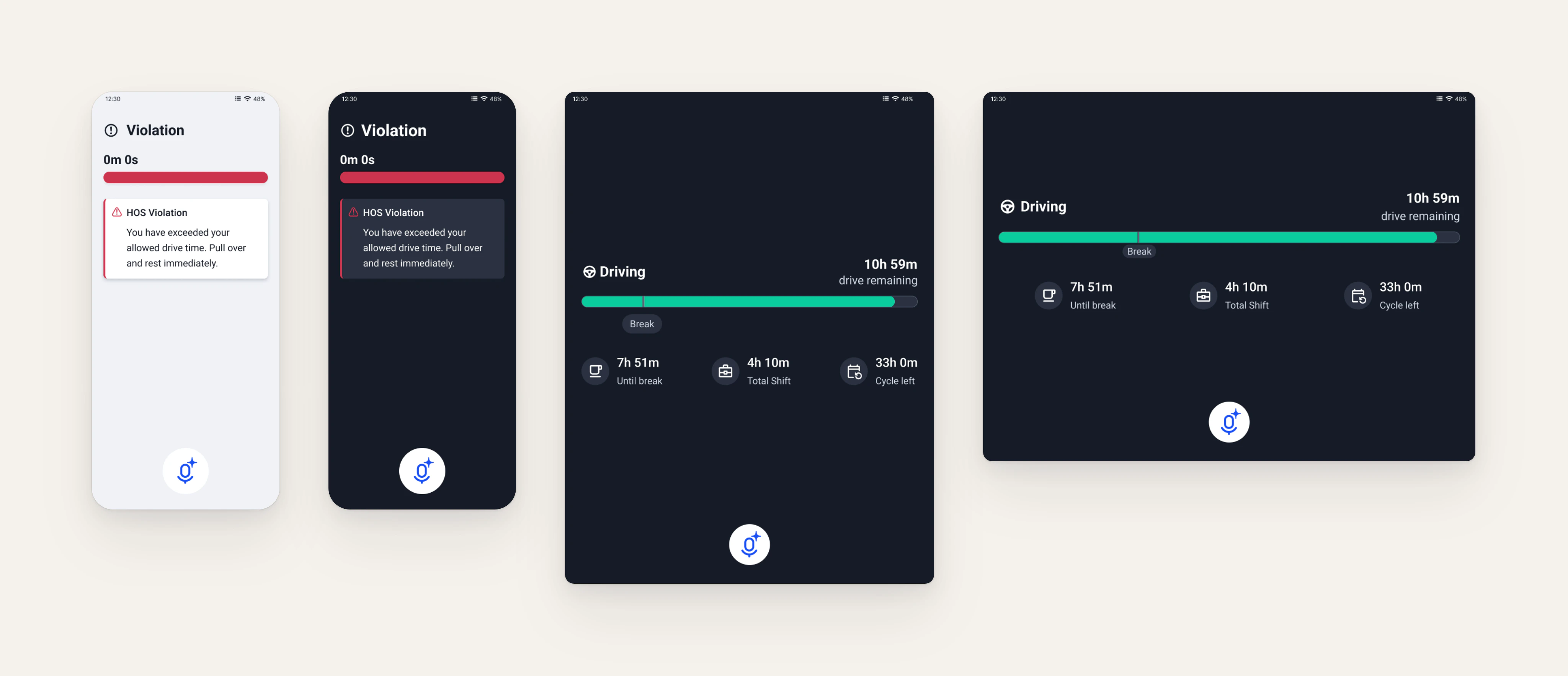
It had to work on a phone in the driver’s hand, a phone in a mount, and a tablet in a mount.
The challenge
Each of those asks something different of the app:
- Phone in hand: the driver has time and both hands free. Standard sizes are fine.
- Phone in a mount: the truck may be moving, so the driver can only glance at it. Text has to be readable in a second, and taps can’t miss.
- Tablet in a mount: the screen is further away, so everything has to be bigger.
The old Drive App was built in the early 2000s and hadn’t changed much since. It looked dated, it was slow, and there was no system underneath it.
We needed one set of components that could resize for each case, so designers wouldn’t have to rebuild every screen for each one.
Foundations
I started with tokens, so that everything built on them could change with a mode.
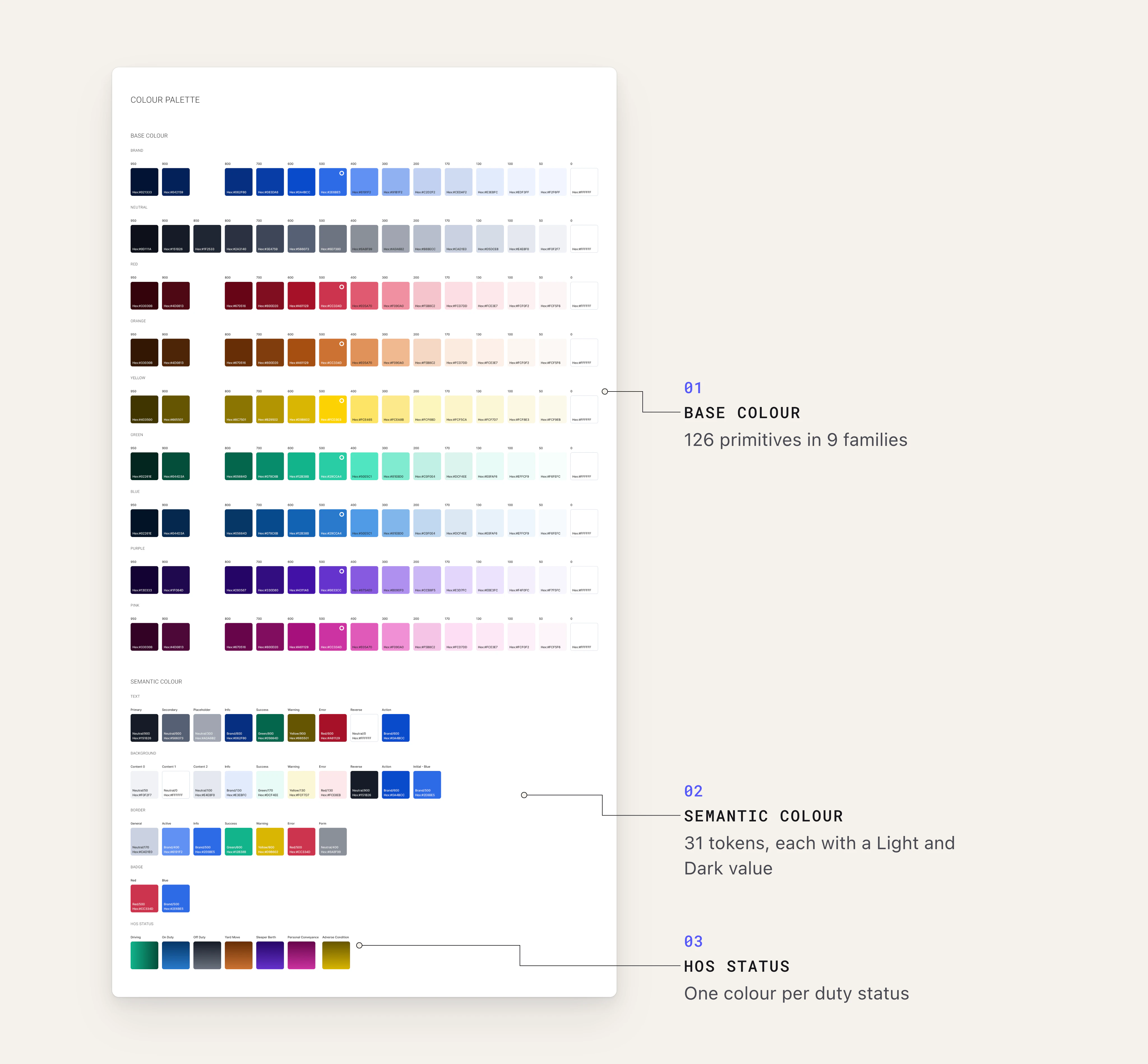
- Colour: 126 primitive colours in 9 families, mapped to 31 semantic tokens for text, background, border, badge and overlay, each with a Light and a Dark value.
- Status colours: a colour for each Hours of Service status, from Driving and On Duty to Sleeper Berth and Personal Conveyance, so drivers can tell their status at a glance.
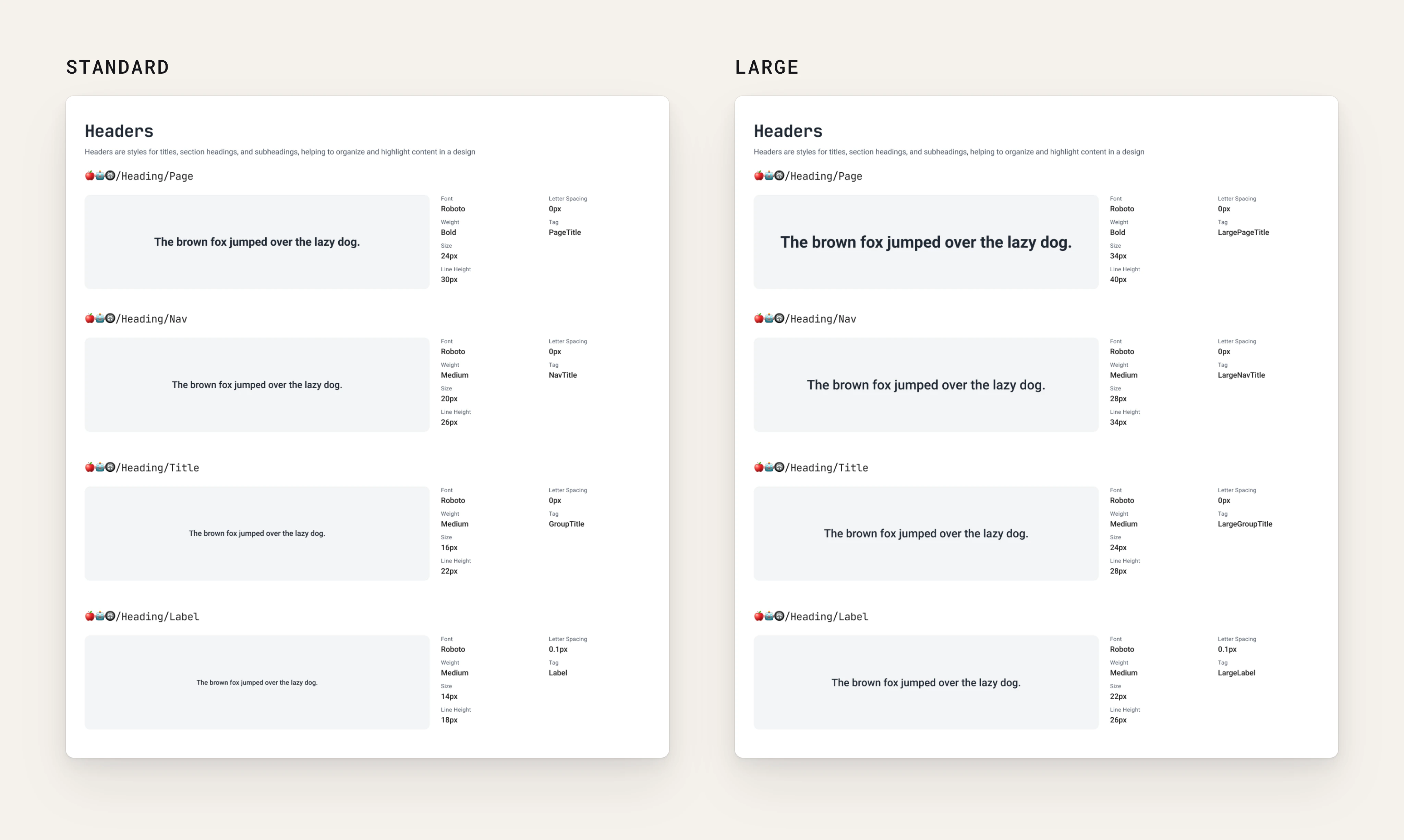
- Type: Roboto in three groups: headings, body and data (for hours, distances and scores). Every style has a Large twin.
- Spacing and corner radius: xs to xxl spacing and s to l radius tokens, each with a Standard and a Large mode.
- Grids: mobile, tablet portrait and tablet landscape.
Driving mode
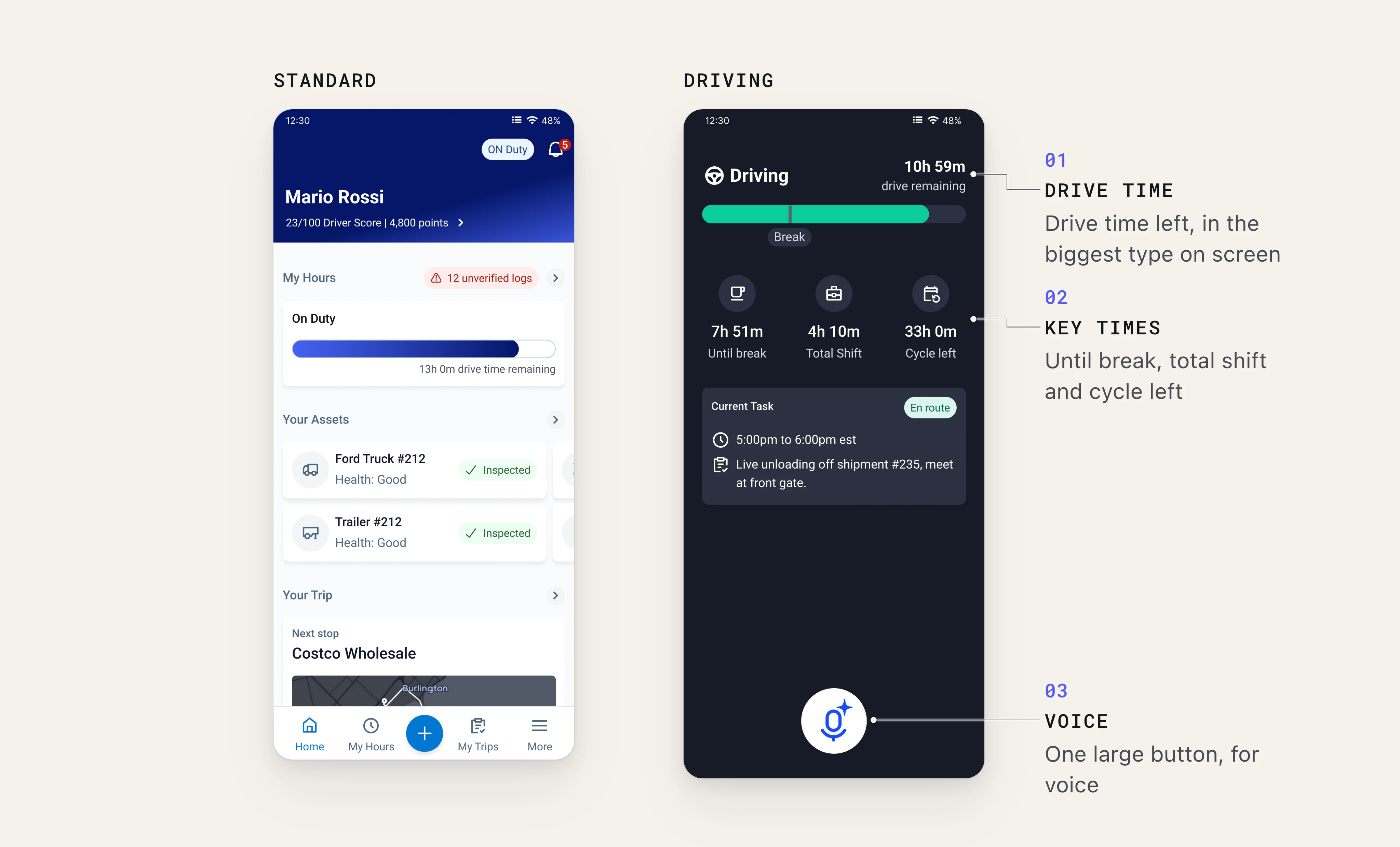
Driving mode is the part I’m proudest of. A driver with a phone or tablet in a mount may be moving, and can only glance at the screen. Every second their eyes are on the app is a second they’re not on the road, and a missed tap means reaching for the screen again.
So I designed the Large mode of the tokens around safety and accessibility first. Each change answers one question: can the driver read it, or hit it, the first time?
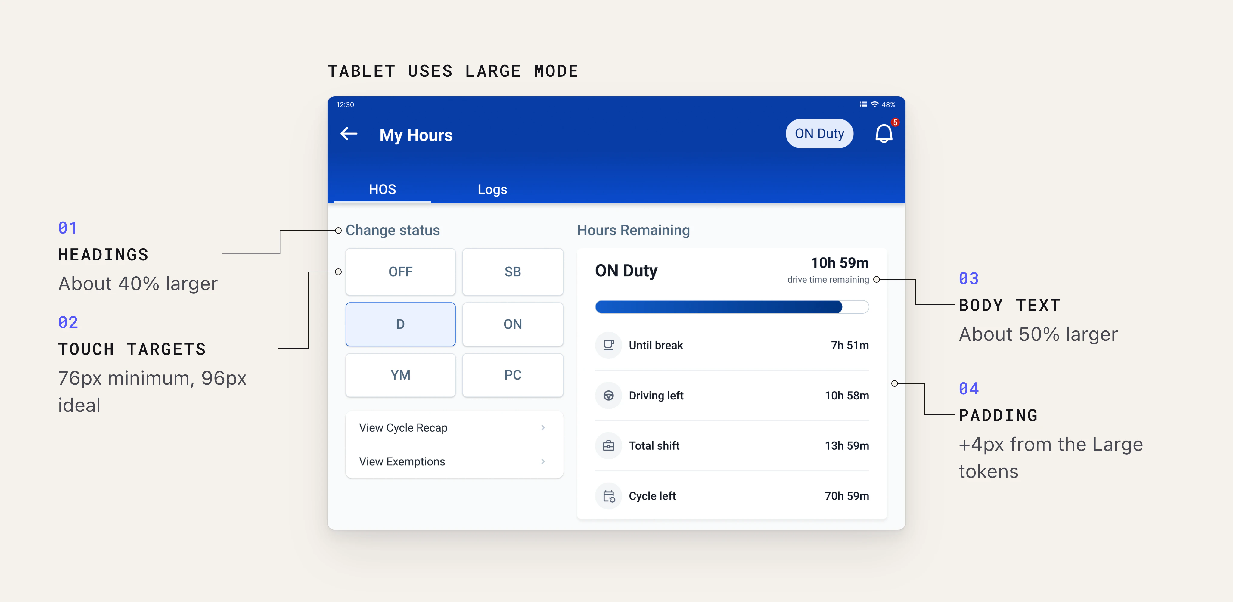
- Type: headings about 40% larger and body text about 50% larger, with line heights scaled to match. Text in a mount is read from arm’s length, in one quick look, so it has to be legible without leaning in.
- Touch targets: at least 76 × 76px, and 96 × 96px wherever space allows. That’s well above the usual 44–48px minimum, because a hand reaching for a mounted screen in a moving truck is far less precise than a thumb on a phone.
- Icons: 24px in Standard, 48px in Large, so drivers can recognise them at a glance. The tap area can be bigger than the icon, and the hand-off shows the padding that makes up the difference.
- Padding: every spacing token grows by 4px in Large. More space between controls means fewer taps on the wrong one.
The changes live in the variables, not in separate screens. Components use semantic tokens, so switching the variable mode from Standard to Large resizes a whole screen at once. Designers only step in when the bigger type and padding start to look disconnected, or when a page needs its own layout.
On a phone
In the driver’s hand, the phone uses Standard. Once the driver starts driving, the app locks to a driving screen: only their hours, in large type, and one large button.
On a tablet
A tablet sits in a mount, further from the driver, so it uses the Large mode all the time. Once the driver starts driving, it locks to the same kind of driving screen.
Light and dark
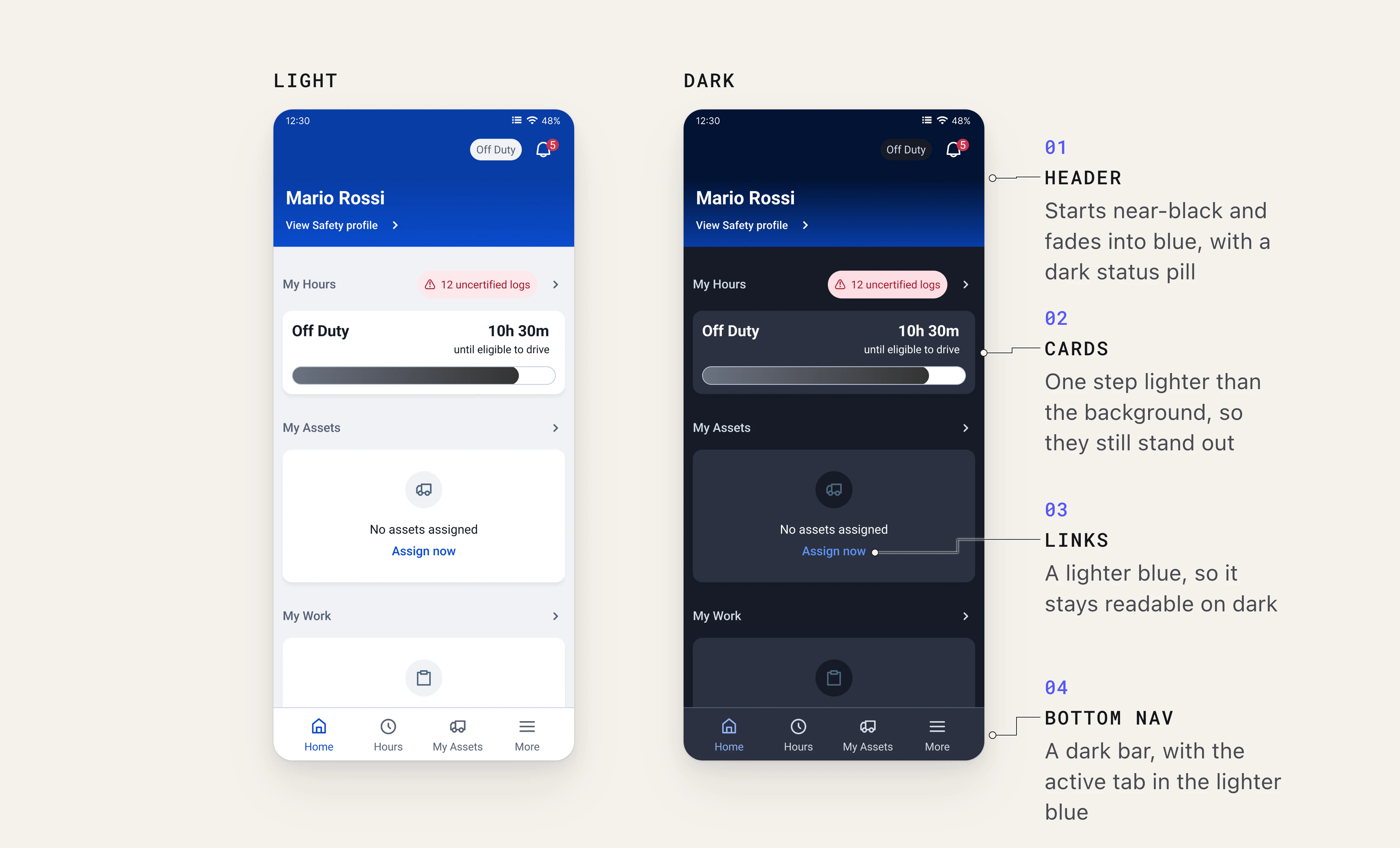
Drivers use the app at every hour, and a bright screen in a dark cab at night is hard on the eyes. So every colour token has a Light and a Dark value, and every component works in both from the start.
Designers don’t draw a dark version of a screen. They switch the variable mode, and the whole screen changes with it. The header is the one exception: its gradient can’t be a token, so it has its own dark variants.
Components
I built about 27 components, and each one had Standard and Large sizes and Light and Dark modes from the start. Some of the main ones:
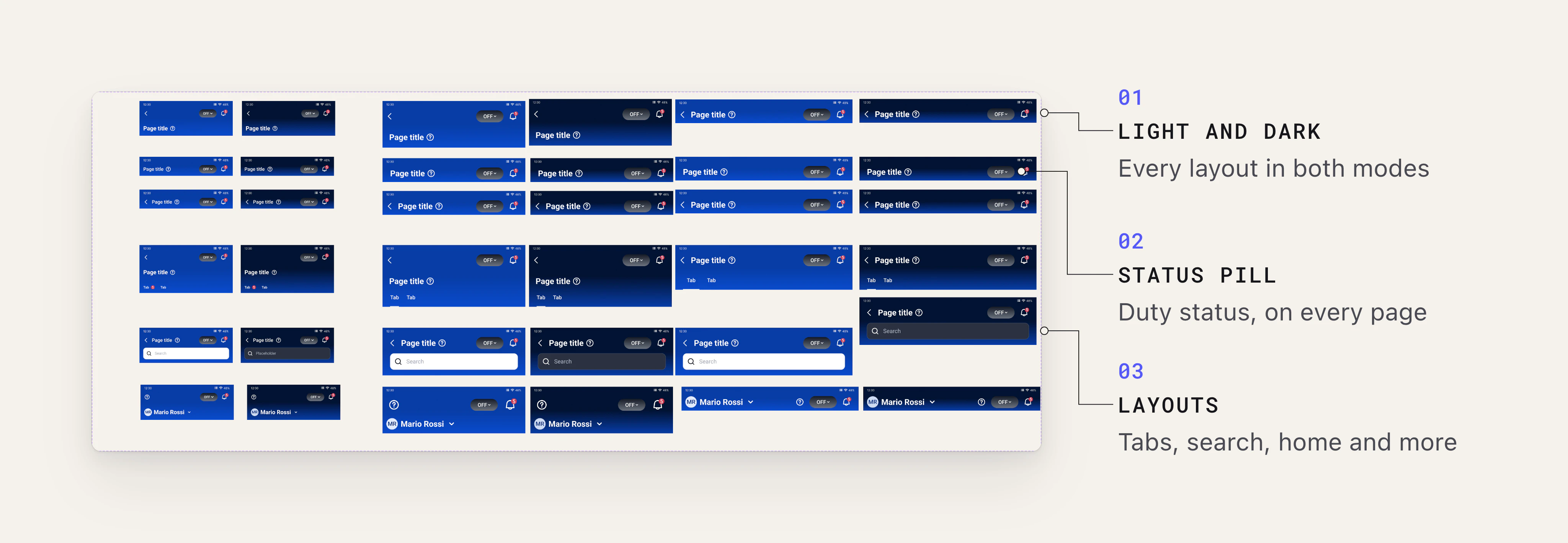
- Header: 36 variants across phone and tablet, light and dark, and six layouts such as tabs, search and the home page. A status pill shows the driver’s Hours of Service status from anywhere in the app.
- Alerts: made for driving mode only, and shown on the locked screen for violations and warnings.
- Fields: text, dropdown and search, with default, active, error and read-only states.
- Lists: standard, notification, asset and settings lists, all built on the same structure.
I set each component up so designers shouldn’t ever need to detach it:
- Seamless changes, controlled by tokens: colours, padding, gaps and corners all use tokens. Switch the mode and every component updates.
- Only the variants you need: variants cover device, type and state. Everything else, like hiding an icon or editing a label, is a simple property.
- Shared building blocks: small base components like icons, tabs and menu items sit inside the bigger ones, so fixing one fixes it everywhere.
- Guidance in the panel: each component has a short description, so designers see how to use it when they insert it.
From Figma to code
I think the future of design system work is one person looking after both the design and the code. Design is my background, and with AI tooling I can now write code quickly too. My front-end knowledge lets me review that code line by line and ship it to a high standard. I want to be a designer who moves seamlessly between the two.
On this project, I didn’t stop at the Figma component. Using Geotab’s internal AI tool, which runs on Claude Opus 5.5, I coded the Button in React and matched the Figma component 1:1: the same variables, sizes, states and properties. Developers got working code to start from, not just a spec.
Try it: change its properties, tap it, or edit the code.
Micro-animation
Micro-animations used to be the first thing cut. Motion is slow to describe in a spec, and building it took developer time the team didn’t have. With AI tooling, I can now build an animation myself in a fraction of the time, tune it until the feedback feels exact, and hand over the code. Small details like this are what make a product feel finished.
The asset list is an example. When a driver taps a row, its background changes colour and the row shrinks slightly, so it’s clear the tap landed. Switch to Slow to see the detail.
Documentation and hand-off
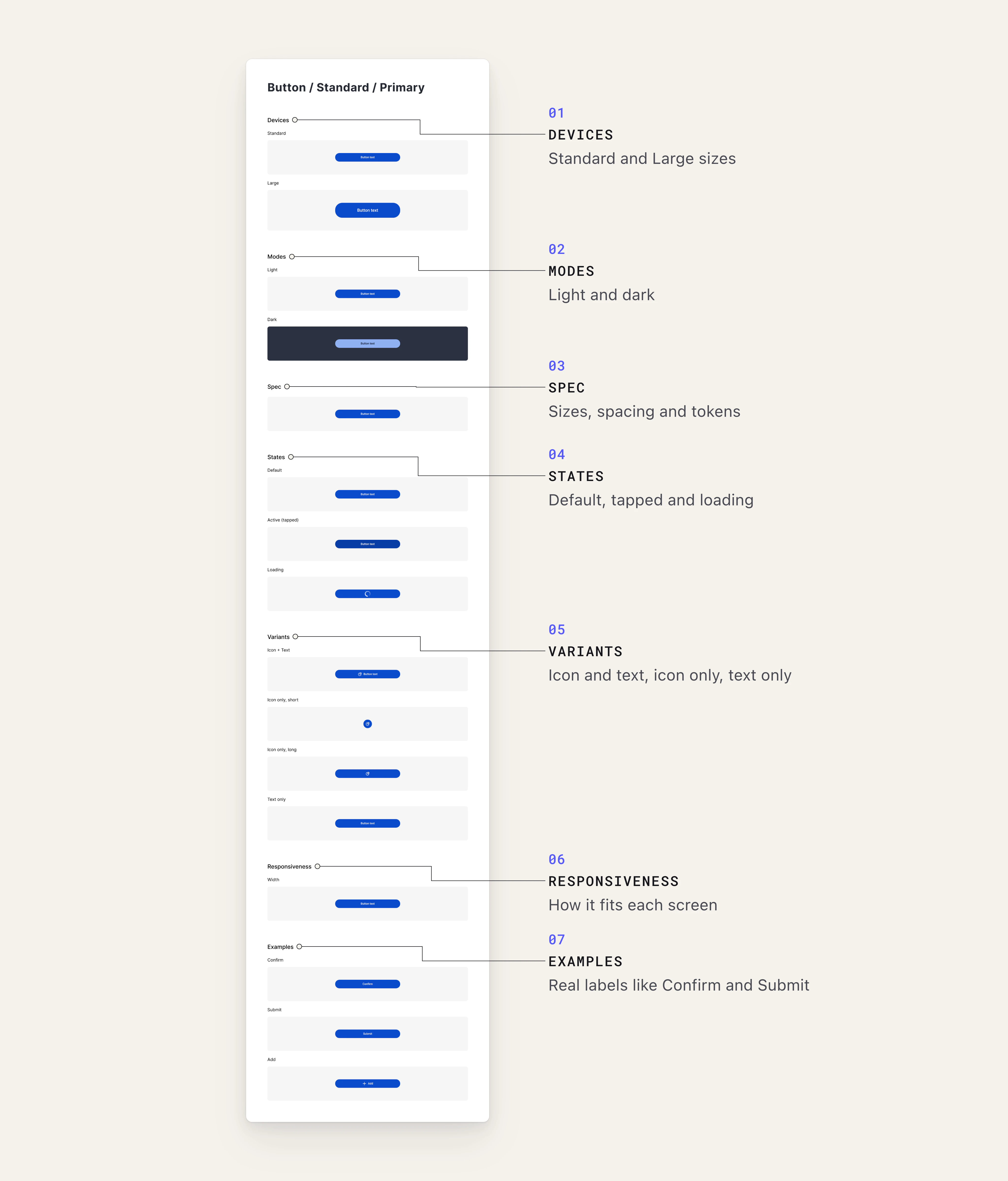
Every component page uses the same template, in this order:
Devices (Standard / Large) / Modes (Light / Dark) / Spec / States / Variants / Responsiveness / Examples / Dev hand-off
The responsiveness notes cover mobile, tablet portrait and tablet landscape. The examples show the component in real screens like My Hours, Settings and Select Vehicle.
What’s next
I spent about 20 hours a week on the Drive App, and designing and fine-tuning the system took three months. Now I’m working with the Drive App designer to code the components with AI tooling and use them in the new app.
After launch, we’ll add more features, like navigation, maps and messaging. Stay tuned!