Jobs on Filter Enhancement
- ROLE
- Product Designer
- DURATION
- ~3 months
- TEAM
- 1 designer, 1 product owner, 1 tech lead, Design system team, Accessibility team, 3 front-end developers, Back-end engineering team.
Overview
As the lead designer for the Platform pod within BMO’s Secure Retail Experience Design team, I work across the design system, from individual components to cross-LOB design patterns, helping create a consistent online experience.
This project focuses on improving BMO’s transaction filters. I’ll share how I identified the problem, explored different solutions, and made design decisions based on user feedback, accessibility, and technical constraints.

The Problem
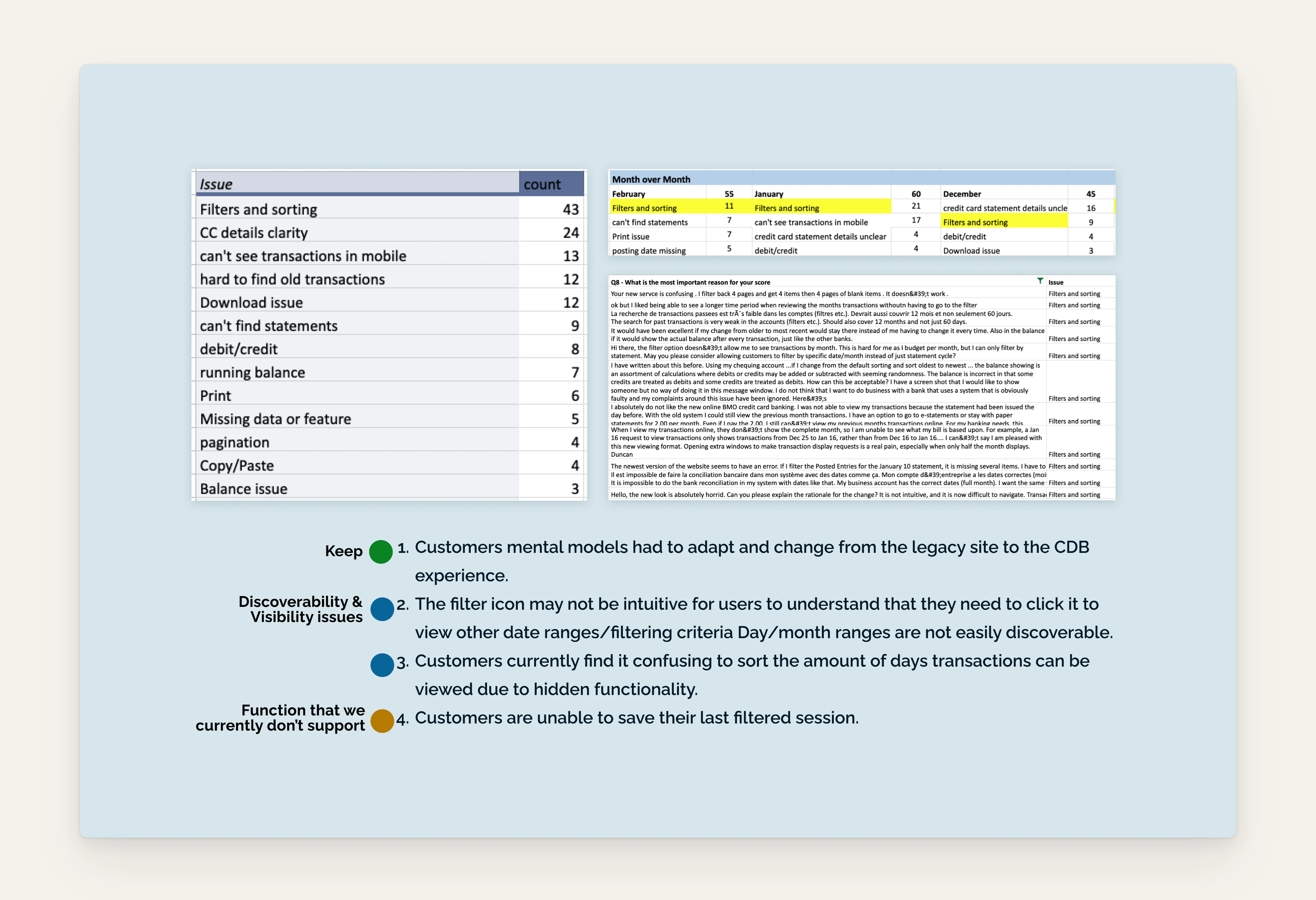
Following BMO’s digital banking revamp, we regularly reviewed monthly customer satisfaction surveys. By January 2023, filter functionality had become the most frequently reported issue on the secure site.
The existing filter bar displayed selected options but wasn’t interactive. Users had to open a side panel to make changes, making the experience less intuitive.
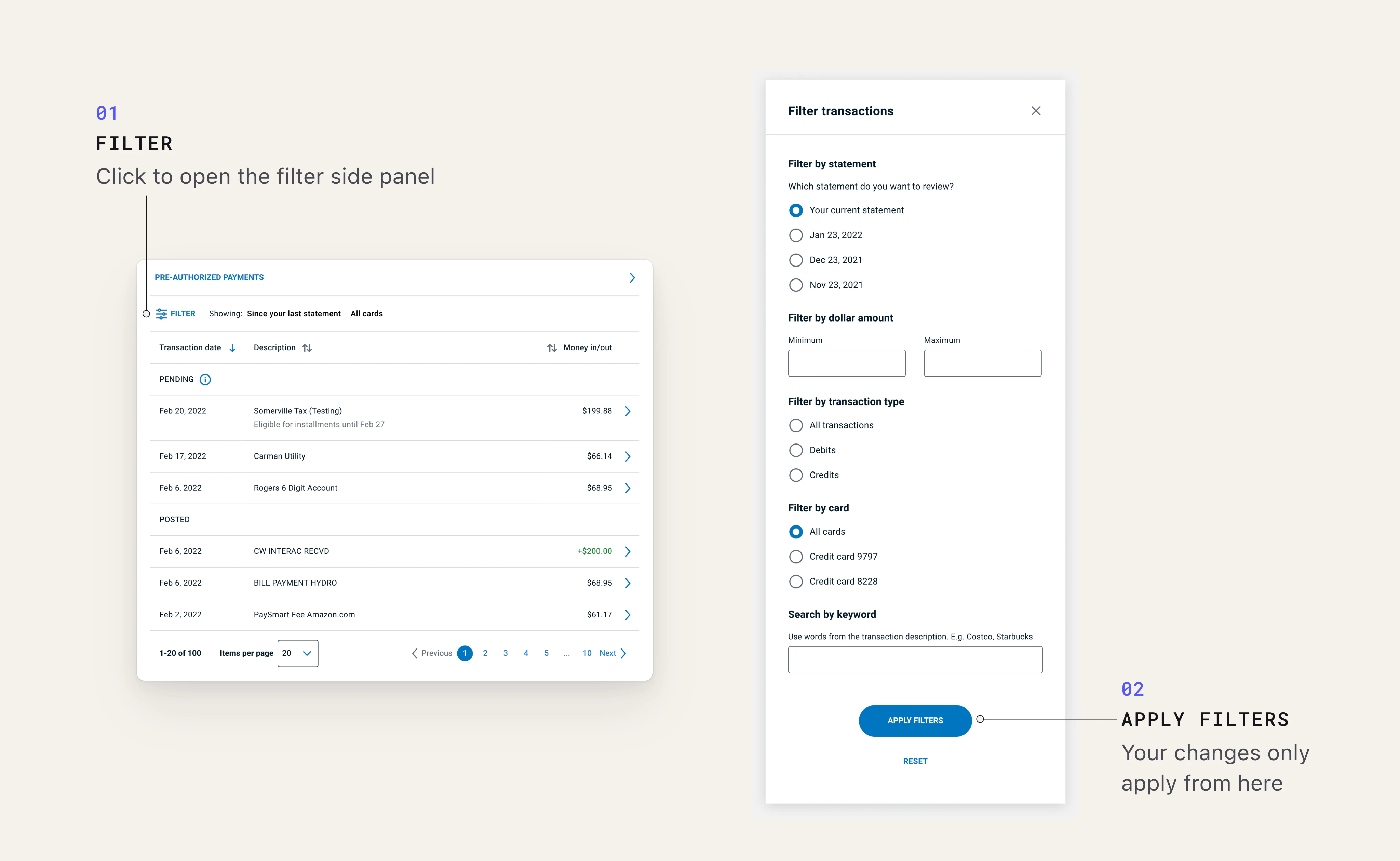
I identified three main areas for improvement:
- Discoverability:
- Users are unaware the filter is interactive
- Visibility:
- Users struggled to understand how to adjust their selections.
- New feature request:
- Some users wanted to save their filter preferences for future visits.
Goals
Desktop: Make the existing filter experience more intuitive.
Mobile: Create a clearer and more usable filter experience.
Exploration
Mobile first, please
Although most complaints came from desktop users, I started with mobile.
I first explored reusing the floating filter from BMO’s legacy app. However, I ruled it out because it could obstruct content when users zoomed in, creating an accessibility issue.
I decide to:
- Keep the existing filter side panel to avoid extra dev work
- Consider desktop as expanded and mobile as compact
- Maintain the filter button’s prominence on mobile as it currently is
I explored three directions:
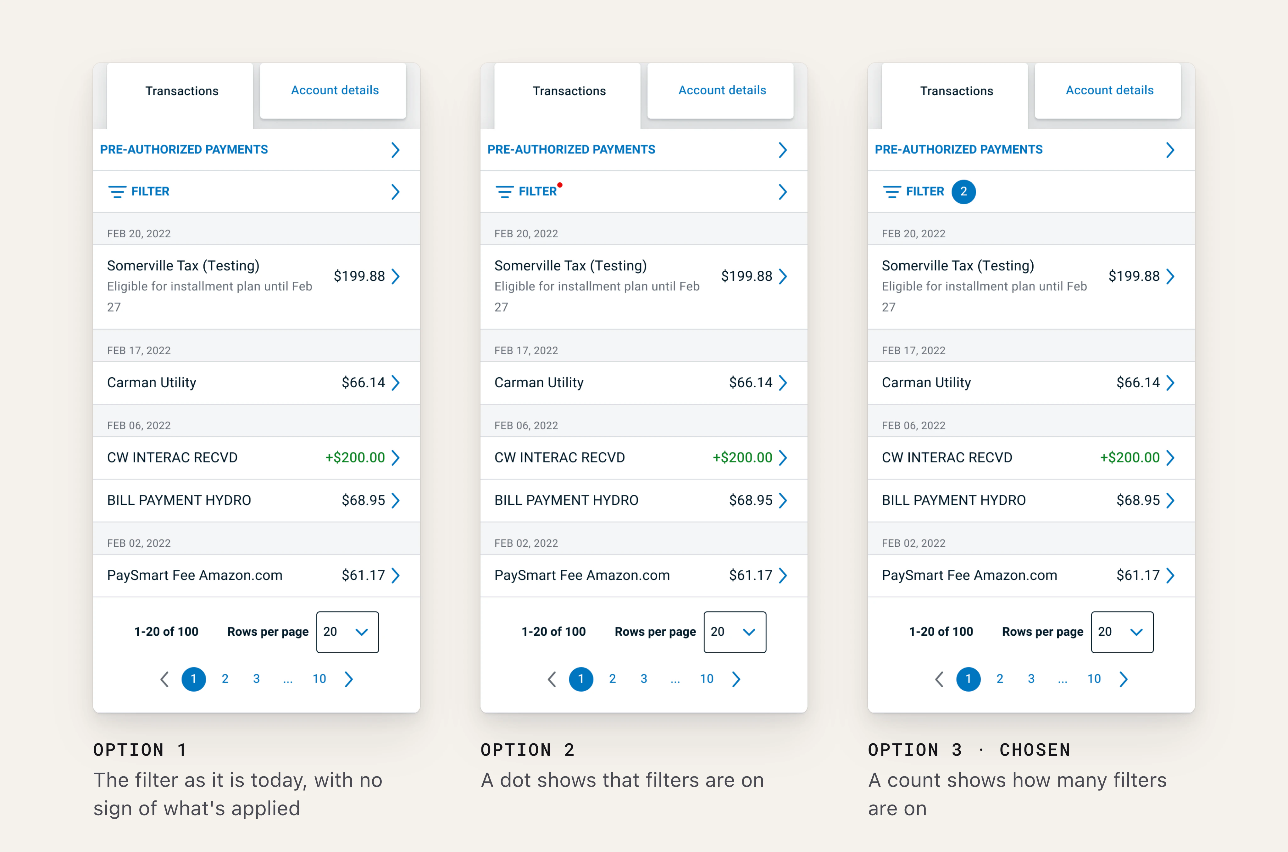
The numerical indicator was an easy win during design review. It made the button more noticeable while giving users clear feedback on their selections.
The first mobile pilot reached 5,000 users and received only three filter-related comments.
Exploring desktop
For desktop, I focused on three improvements:
- Making the filter panel easier to access.
- Making interactive elements more obvious.
- Allowing users to remove selected filters directly from the bar.
I explored four design directions and reviewed them with my team, including developers, an front-end accessibility specialist, and a Design System designer.
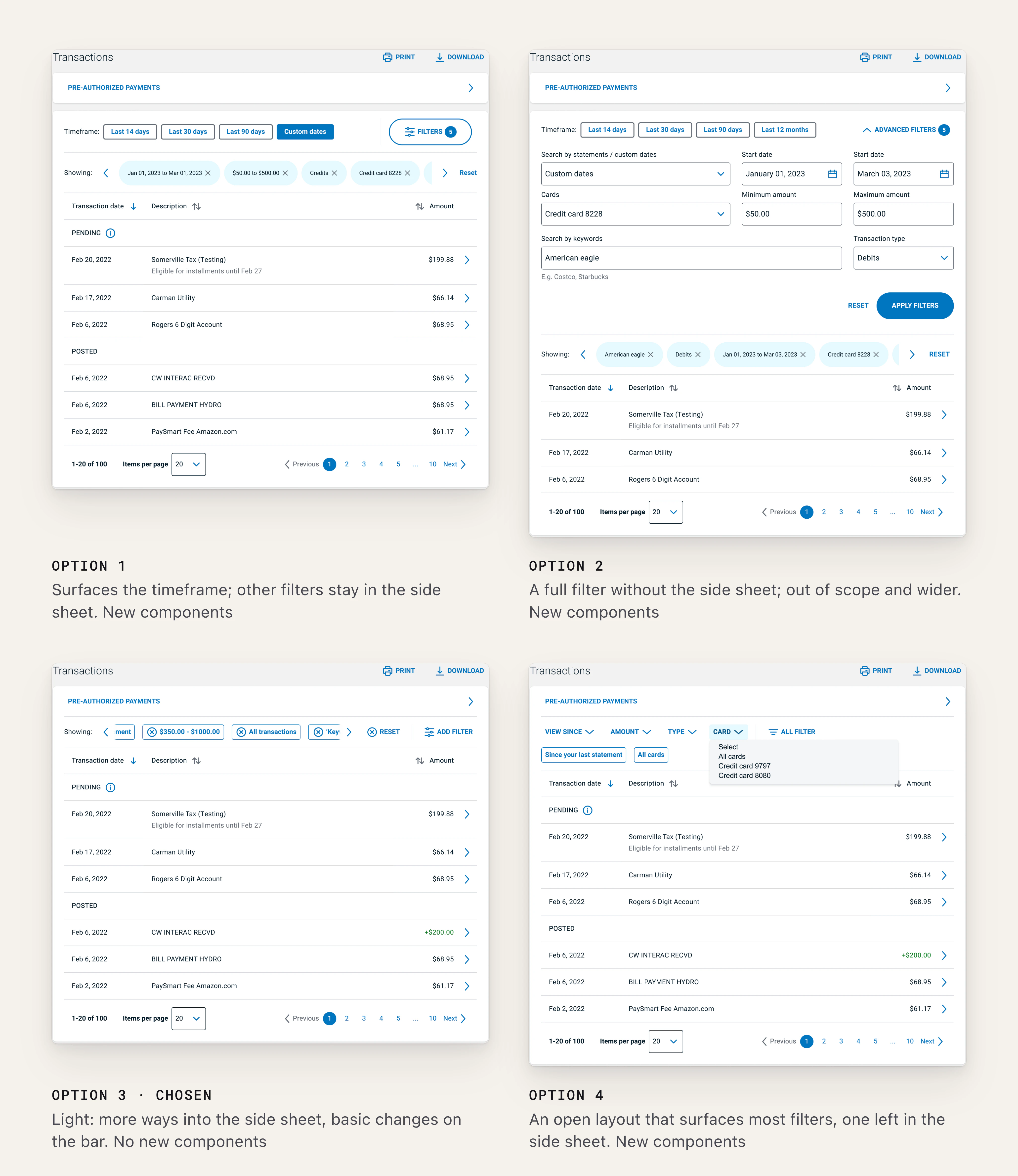
We selected the third direction because it offered:
- Good usability improvements
- Minimal changes to existing components
- Low development effort
I also explored saving filter preferences, but after discussing technical feasibility with the development team, we decided to put this feature on hold.
Design Decisions
Making filters easier to interact with
During refinement, I revisited the BMO Design System and replaced micro buttons with chips, for two reasons:
- Familiarity: Users were already familiar with chips as a filtering interaction on BMO’s public site.
- Consistency: Chips better align with the existing Design System hierarchy.
I also removed the horizontal scrolling controls and adjusted the layout to show more filter options at a glance.
Validating the design
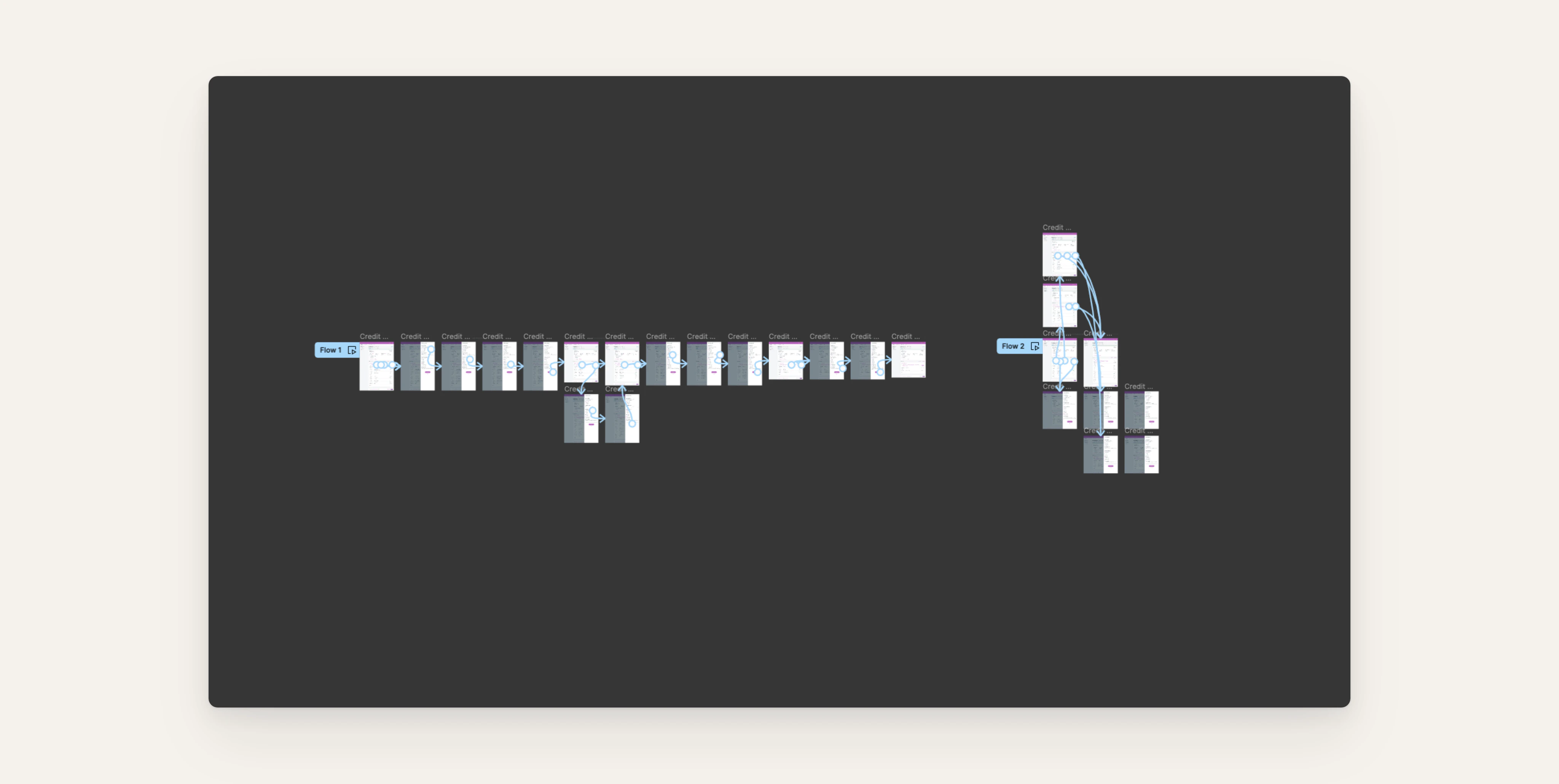
For the usability test, I prepared two prototype versions, masked the BMO branding, and recruited 20 qualified participants.
After the sessions, I tagged and analyzed the feedback.
The results supported the proposed design:
- 70% accessed the filter panel through a filter chip
- 40% removed an individual filter directly from the bar
- When asked to clear all filters, 37% used the remove button, while 32% removed filters individually.
The results showed that users could find and interact with filters more directly.
The Solution 🎉
The final design introduced a more interactive filter bar on both desktop and mobile.
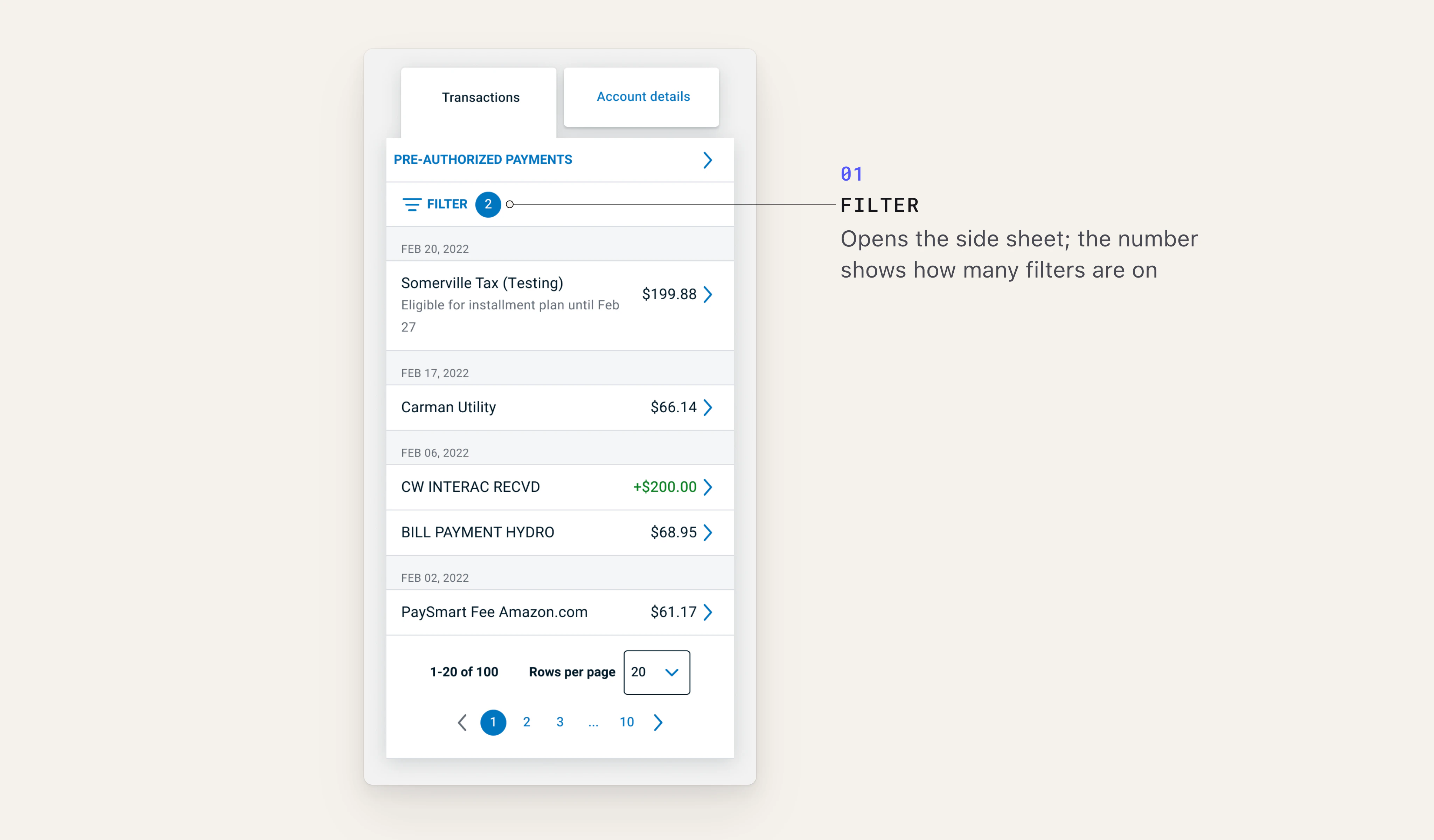
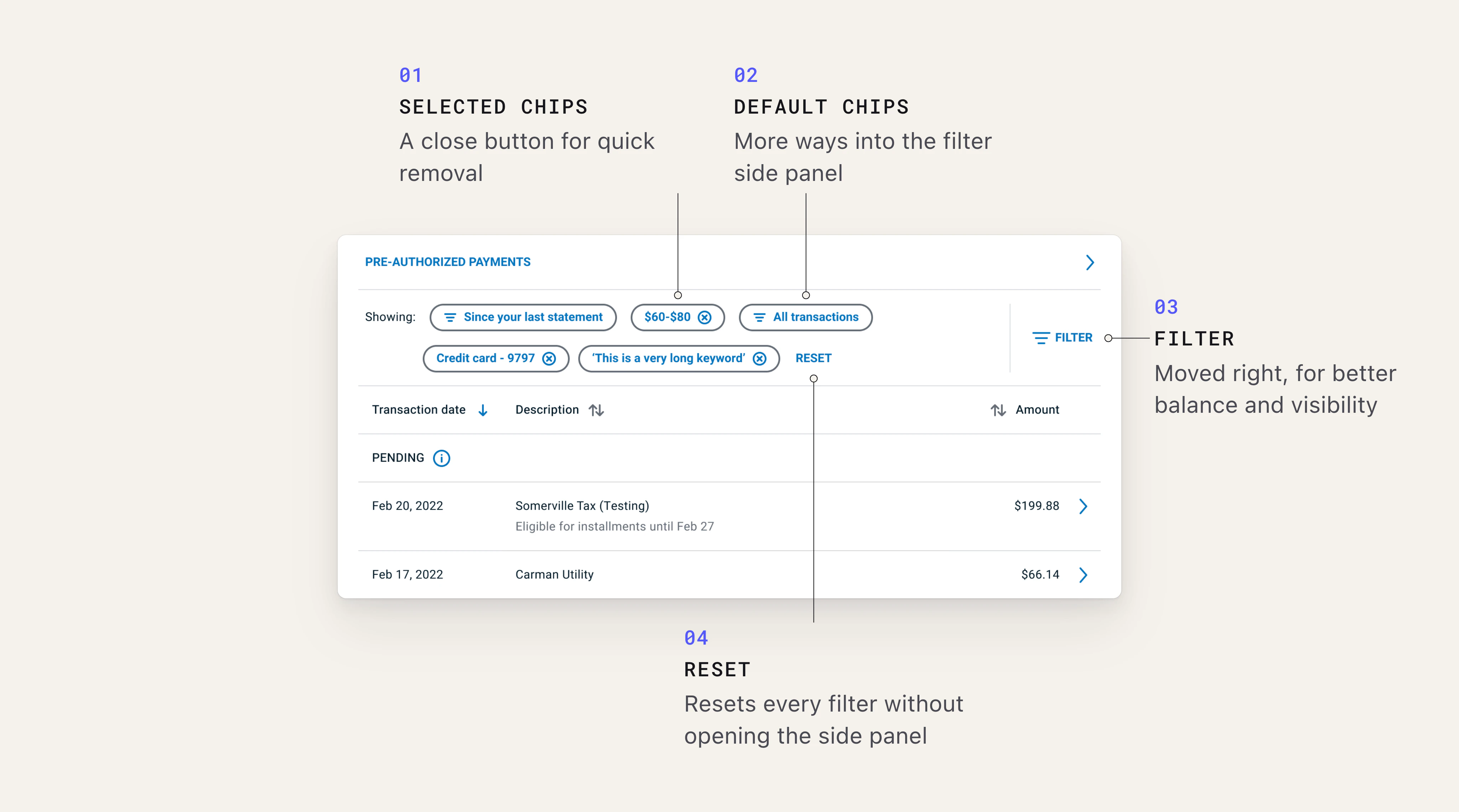
Users can now access the filter panel more easily, see their selected filters at a glance, and make changes directly from the filter bar.
Impact
After the enhanced filter bar was introduced in the pilot, monthly filter-related complaints dropped from around 20 to just 1.
One piece of feedback that stood out to me:
“I had been considering changing banks because of the confusions due to the new website, but now I can recommend BMO to my family and friends again.”
It’s encouraging to see a relatively small design improvement make a difference to the overall experience.
Takeaways
Small improvements can make a difference:
Monthly customer surveys helped me identify usability issues quickly and address them through incremental improvements, without needing a lengthy research process.
Reduce the effort behind simple tasks:
Making filter selections interactive changed the experience from opening a panel to find an option to simply clicking the filter itself.
Think mobile-first:
Starting with mobile helped me prioritize essential interactions, making design decisions quicker and the transition to desktop smoother.
What’s Next
A couple of opportunities came up during testing and the pilot:
Content clarity: Some users found the terms “debit” and “credit” confusing. I suggested exploring simpler labels such as “Money in” and “Money out” with the content team.
Filter panel accessibility: Users on smaller screens or with increased zoom may have difficulty reaching the Filter and Reset buttons. I’d like to explore ways to improve their visibility and accessibility.